
How to create an accessible toggle component in Ember?
In this tutorial, we are going to create an accessible toggle component in Ember using the WAI-ARIA specifications.
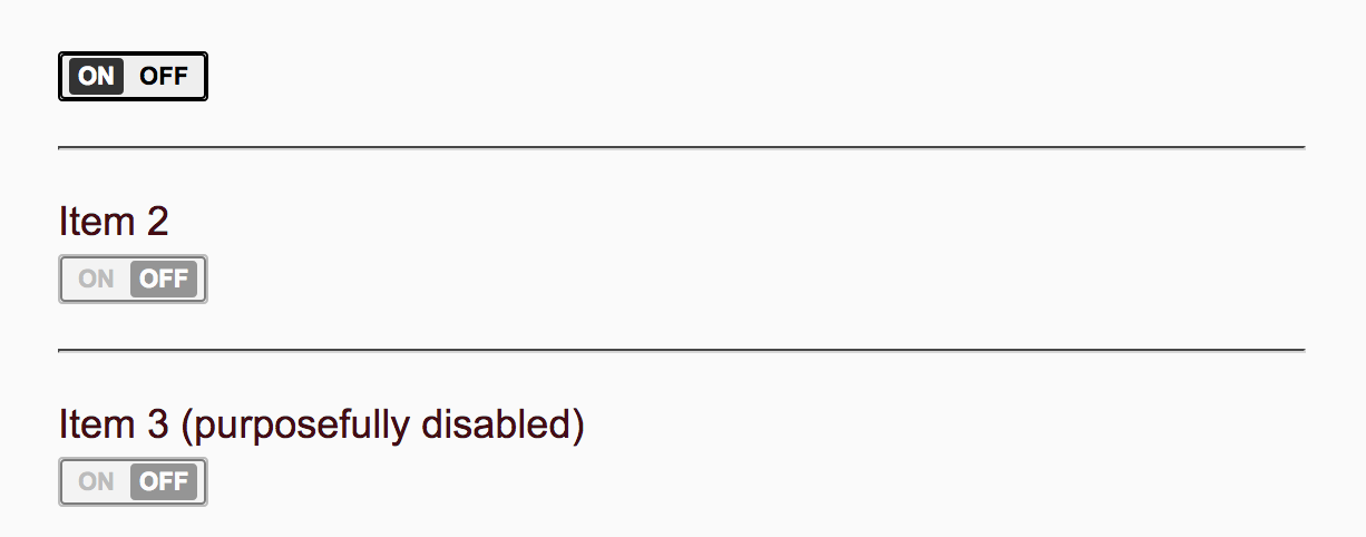
A toggle or switch component is a type of checkbox that represents on/off values, as opposed to checked/unchecked values.

First we are generate the component by firing up our ember-cli tool:
> ember g component aria-switch
The default component skeleton will look like this.
import Component from '@ember/component';
import layout from '../templates/components/aria-switch';

export default Component.extend({
  layout,

});
Next we are going to import the computed and reads methods from ‘@ember/object’ and ‘@ember/object/computed’. We are using the new module syntax which will make Ember applications start faster, by replacing the Ember global with a first-class system for importing just the parts of the framework you need.
To know more about the new module syntax, please refer to this RFC.
import { reads } from '@ember/object/computed';
import { computed } from '@ember/object';
import Component from '@ember/component';
import layout from '../templates/components/aria-switch';

export default Component.extend({
   layout,

});
Next we concentrate on the component template for now. The template code is very simple since we are just going to have some labels for ON and OFF, since we are going for the primary button in the component, the template is only going to have two span elements like this:
<span> {{onLabel}} </span>
<span> {{offLabel}} </span>
Next we will add a checked property to notify the toggle state whether it is on or not.
checked: false
ARIA attributes
The following are the list of ARIA attributes our switch component will be using and the purpose of each and every attribute is listed below:
aria-checked
The aria-checked attribute of a switch indicates whether the input is on (true) or off (false).
aria-label
The aria-label defines a string value that labels the current element. The purpose of aria-label is to provide the user with a recognizable name of the object.
aria-labelledby
The aria-labelledby attribute identifies the element (or elements) that labels the current element. The purpose of aria-labelledby is the same as that of aria-label.
role
The role attribute allows the author to annotate markup languages with machine-extractable semantic information about the purpose of an element. Use cases include accessibility, device adaptation, server-side processing, and complex data description. In our case, the role attribute will be assigned a value of switch to indicate that it is a toggle button.
HTML Attributes
In addition to the ARIA attributes mentioned above, the switch component will also make use of some HTML attributes for manipulating the markup and controlling the behaviour of the component.
data-action
dataAction: 'aria-switch'
data-keep-disabled
dataKeepDisabled: reads('disabled'),
type
type: 'button',
So the final set of attributeBindings will be something like:
attributeBindings: [
    'ariaChecked:aria-checked',
    'ariaLabel:aria-label',
    'ariaLabelledBy:aria-labelledby',
    'dataAction:data-action',
    'dataKeepDisabled:data-keep-disabled',
    'disabled',
    'role',
    'type',
  ]
Then we will have a property called ariaChecked which will read the checked property passed to the component.
ariaChecked: computed('checked', function() {
    return this.get('checked') ? "true" : "false";
  })
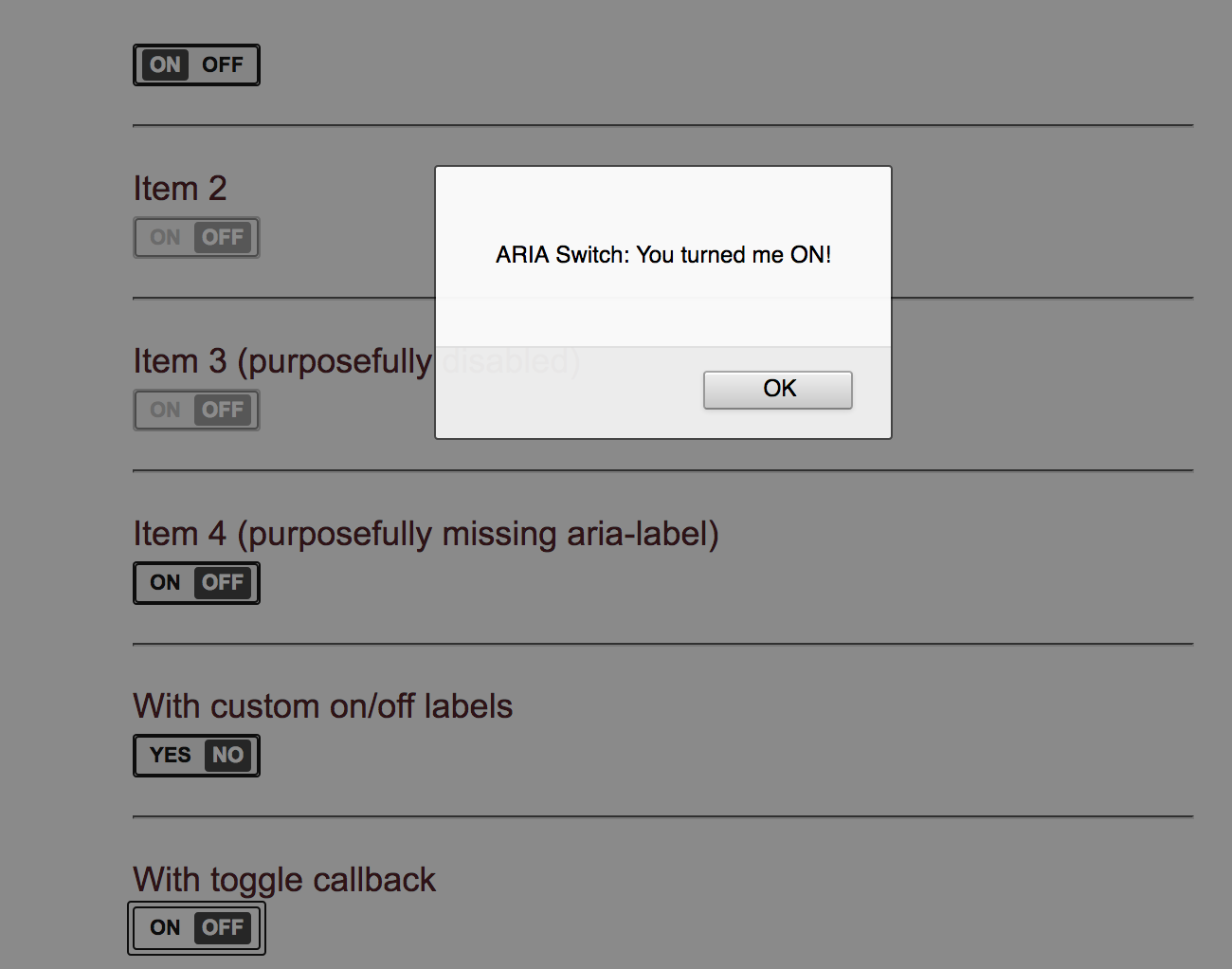
Then finally we will handle the click event for the component. We can handle the same in the default click() event, which does two things. One we need to toggle the checked property, second we need to invoke the callback function passed to the component once the status is toggled.
click() {
   this.toggleProperty('checked');
   if(this.get('onToggle')) {
     this.get('onToggle')(this.get('checked'));
   }
 }
The final code for the component.js will look something like this:
import { reads } from '@ember/object/computed';
import { computed } from '@ember/object';
import Component from '@ember/component';
import layout from '../templates/components/aria-switch';

export default Component.extend({
  layout,
  checked: false,
  dataAction: 'aria-switch',
  offLabel: 'Off',
  onLabel: 'On',
  role: 'switch',
  type: 'button',
  tagName: 'button',
  attributeBindings: [
    'ariaChecked:aria-checked',
    'ariaLabel:aria-label',
    'ariaLabelledBy:aria-labelledby',
    'dataAction:data-action',
    'dataKeepDisabled:data-keep-disabled',
    'disabled',
    'role',
    'type',
  ],
  ariaLabel: reads('label'),
  dataKeepDisabled: reads('disabled'),
  ariaChecked: computed('checked', function() {
    return this.get('checked') ? "true" : "false";
  }),
  click() {
    this.toggleProperty('checked');
    if(this.get('onToggle')) {
      this.get('onToggle')(this.get('checked'));
    }
  }
});
Now we can invoke our component like this:
{{aria-switch label="My Label" checked=true}}
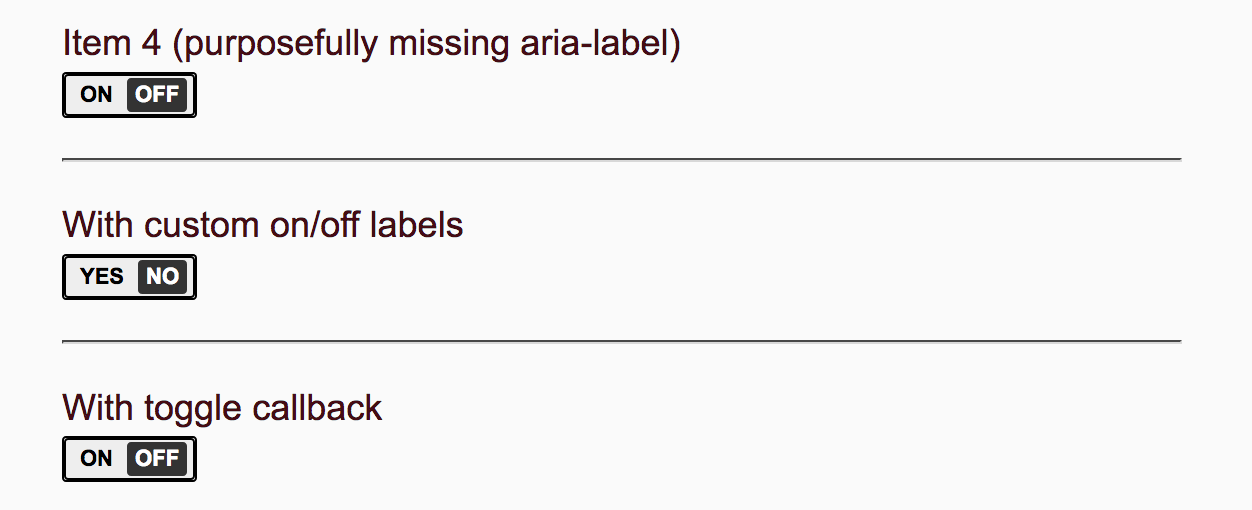
With custom on/off labels
{{aria-switch onLabel="Yes" offLabel="No" class="toggle toggle-primary"}}
With toggle callback
{{aria-switch onToggle=(action 'toggleCallback')}}
Source Code and Demo
References:
Image Credits:
Photo by Mikkel Bech on Unsplash


